Monday, May 14, 2012

High Point Furniture Market - call it Mecca for Interior Designers.


Just back from the High Point Market for Home Furnishings in North Carolina and the strong trend for home furnishings is COLOR. There were splashes of rich hues everywhere in the gorgeously designed showrooms.  High Point Market takes place twice a year and is the place for the furniture industry to meet, greet and see what’s new.

My husband joined me on this trip, somewhat kicking and screaming.  He had heard horror stories from his guy friends who attended a couple of years ago.  They didn’t last a day.  You see, this furniture show is an entire city, yes I said a city, of showrooms.  There are even shuttle buses to conveniently transport you around the 10 million square feet of furniture and furnishings displayed by 2000 exhibitors. Luckily High Point has figured out a solution for show fatigue by plying visitors with food and drink at literally every turn.  It is easy to keep the spouse on the move with the temptation of a Moroccan lunch in a lighting showroom.  And we practically heard a bell ring at 4 o’clock, the start of the Cocktail Hour, or maybe it was the shouts of “Ginger Martinis in Aisle 4” that caught our attention.

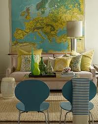
So back to color.  These bright punches of color were used boldly on accessories and liberally on chairs, large pieces of furniture and lighting. The most eye-catching display was a set of dining room chairs, each shouting its own loud color in a curvy, space age shape.  It was made up of interwoven strapping material that was surprising comfortable. You could not miss nor forget these chairs.  Unwinding one evening, we decided to go to movie The Hunger Games, and were elbowing each other when the chairs showed up in the lavish dining room scene. This is how trends start.


Visiting one of my favorite showrooms, a manufacturer that makes chandeliers out of hickory twigs, we again saw the use of bright punches of color.  They had their usual display of natural twig chandeliers, and then there was goldenrod, sunset orange and scarlet chandelier and sconces. It was a magical experience to stand beneath the sparkly colorful canopy of twigs.


In another lighting showroom, we came across an antique birdcage filled with brightly colored birds in turquoise.  It only makes sense that the birds were wearing turquoise, this manufacturer’s signature color, which repeats over and over again in their chandeliers and table lamps. Designers actually think about this stuff. Amazing.


Sunday, April 15, 2012

What you should never say to your living room furniture: "Everyone up against the wall."


I am always somewhat bemused and slightly bewildered walking into a client’s home for an initial consultation when I see every single piece of their living room furniture pressed up against the walls.  I always wonder if a hoedown has occurred and I have not been invited.  I am teasing, but there does seem to be a common misconception out there about how to arrange furniture.

Flip through any shelter magazine and you will see pleasing arrangements of sofas, chairs and occasional tables within arms reach of one another.  Frequently entire compositions are put in the center of a room, which in decorator jargon is called “floating” the furniture.  Then the wall space can be freed up for tall bookcases or hutches and side tables to hold lamps.  The key is to place your sofas and chairs along with the occasional tables that make up a grouping close enough together that your guests do not have to shout at one another to be heard.  You want to create a comfortable room that invites you to come in, sit down and have a chat.

Every room has its own geometry but there is a guiding principle to start with and that is to find the focal point of the room and arrange your seating towards it.  A focal point could be tied to the architecture, like a fireplace or window with a stunning view, or it can be a dramatic piece like a marvelous hutch. Use your imagination in creating a focal point thinking of it as the star of the room.

Before rearranging your furniture ponder what you are actually going to do in the living room.  If you are going to spend a lot of time reading then make sure you have a comfortable chair and good reading light.  If your family watches TV, accommodate this activity in the most aesthetically pleasing way as possible. Perhaps a flat screen TV surrounded by a built in bookcase to the right of the fireplace would do the trick and keep the focus in the same direction as the main architectural element.

Another good trick is to throw a party and observe your guests for clues as they move chairs closer together and find places to put down their drinks.  This will give you tremendous insight into the function of the room and will give you some guidance on the changes that need to be made.

And if you are planning on dancing at one of your parties then by all means push the furniture out of the way temporarily and go for it. You can rearrange it in the morning.

Saturday, April 14, 2012

Selecting paint colors. When art meets science.


Peel back the layers of any wall and I am sure you will find a few mistakes in the selection of paint colors.  Even experts, on occasion, select the wrong shade now and then.  Let’s find out about the science of paint so that we have more confidence in selecting “mistake-proof” colors for your home. 

What’s in that paint can anyway? Paint is made from four components: pigments to give the paint color; solvents to make it easier to apply; resins to help it dry; and additives for fillers and antifungicidal agents.  While the basic white pigment is titanium dioxide, the whitest material known to exist on Earth, other colors are made from natural and synthetic pigments such as iron oxide for reds, metallic salts for yellows and iron blue for blues.

Did you ever wonder why you have to apply more than two coats with less expensive paint?  It’s because cheap paint has more solvents per volume and therefore less pigment and resins than better quality paint. You are applying more water, which evaporates and leaves less pigment behind.  In the end, you may not be saving as much money as you thought because you will need more product and it will take twice as long.

Another factor to consider is the number of colorants in paint. Most paint makers use 12 colorants but superior paint manufacturers create paint with more colorants, which gives an intense saturation rate creating deeper hues.  This creates complex colors that vary all day long with the changing light of the room, making for a very interesting visual experience. 

Most important of all when selecting paint, bring your swatches into the room that is being painted to see the color in the actual light.  According to Mya Kagan, a color expert: “Color is the way our eyes interpret the energies contained within a beam of light! When light touches an object, some of these energies are absorbed and others are reflected back. It’s the energies that are reflected which your eyes collect and then interpret as a specific color.”  Doesn’t that sound magical?  That is why your paint chip will look different in the store, under fluorescent lights, than it will in your home.  Another common mistake is evaluating the color on one of those multi-colored strips from the paint store. It is best to cut away the chip you are interested in and look at it on its own, because it will be influenced by the company it keeps.

I realize that this has barely scratched the surface on the story of paint but perhaps knowing a bit about the science behind such a common household product will demystify it and lead to a less frustrating experience in the paint store.

TURTLES carry their homes on their backs.


My mother-in-law and her best friend recently set out on an epic journey to visit all 50 states of this great country. They are traveling in a red Honda CRV named Gypsy. This winter they will complete their journey with a trip to Hawaii, I guess saving best for last.

Let me back up a bit to say that when they announced to their family and friends that they were selling their homes and most of their earthly possessions, moving what was left to storage and hitting the open road, not many of us really thought it would happen.  You see my mother-in-law’s house in Burlington was dubbed “Grammy Land” by her grandchildren who astutely surmised that they could get away with just about anything once they crossed the magical threshhold of Grammy’s kingdom.  It was filled with sugary breakfast treats, toys and children’s books aplenty and late night movie watching marathons complete with all the popcorn they could eat.  The walls were lined with the family story in photos and the cupboards were filled with a treasure trove of cups, saucers and dishes collected over a lifetime.  Christmas was when Grammy’s house really shone, decorated with reckless abandon that made even Macy’s envious.

The debate among the siblings, whispered quietly in the hallway outside of the kitchen, ranged from disbelief to a dawning awareness that they were actually serious about this little adventure.  I bought them a book on weather patterns that year at Christmas in the hopes that they would read it cover to cover to learn about the danger signs for storms.  Looking slightly quizzical, they politely thank me.

It took Mom and Sue about a year to sell both houses, time they used wisely to plan their route and stock up on provisions for a life on the road. They bought a new computer and started a blog to post photos so that their families could stay connected while tracking their slow crawl across the country.  They set up a deliberate routine to handle the change of a different motel room each night.  Their car became the most important possession they owned, treating her like royalty, stopping often for full body tune ups.  Mostly, they had each other to share the day with and to plan tomorrow’s adventure.
 It has taken them two years to complete their 50 state journey.  They tell us they are seeing the world with different eyes after all they have experienced.  We asked them if they are ready to settle down now.  Looking at each other, in low tones they mumble something about their curiosity in our Canadian neighbor to the north.

Here they go again!

Wednesday, March 14, 2012

BACKSPLASH TILE. A cautionary tale.

It all started with the backsplash tile.  I had black and white rooster wallpaper as a backsplash above my kitchen countertops.  What can I say?  It was the 90’s and roosters were really in.  I realize now that it was a mistake, so I informed my husband that I was going to visit Village Tile to select an affordable tile to replace the roosters.  I saw the delight in his eyes, which encouraged me.  I don’t think he ever liked the toile.  Who knew?


I found a lovely cappuccino colored tumbled marble tile and brought it home only to discover that it was not working with the formica countertop, also from the 90’s. So, off I went to RK Miles to browse their spinning tower of granite, keeping to the Basic Collection as opposed to the Exotic and Select sections, thinking myself quite prudent. A week later, I found myself in a granite stone yard in New Hampshire with my best friend, Ginger, as we perused row upon row of incredible granite slabs. We wondered how all this granite with exotic names like Aurora Borealis, Blue Pearl and Giallo Veneziano was created?

A bit of internet searching came upon this clear scientific explanation: “Granite is a hard igneous stone that is formed over millions of years ago by volcanic activity.  During the process, magma combines with various minerals to create a crystal appearance.” That would explain the sparkle of crystals and unique pattern and color of each slab.

Isn’t that amazing?!?  Who wouldn’t want granite in their kitchen?  I was putty in their hands as I chose my very own slab of granite.  I returned to RK Miles to let them know my final choice of granite and told them I was thinking of reusing my sink and faucet, which really weren’t that bad.  Neina patiently explained that if I was going to the trouble of installing granite countertops, I would really want an undermount sink and a faucet with a spray attachment.  It did seem like the wise path to take. I perused their showroom to select my choice of deep bowl sink and gooseneck faucet.

Trying to regroup, my husband and I looked around our open floor plan kitchen/living room and dining room and confessed to each other that the draperies were never really us.  I told him that I always thought the red draperies with gold motif were more our friends, Sally and Bob’s taste.  There house has a bohemian, Tibetan flare and these drapes would go perfectly with their color scheme.  I always wanted simple off white linen draperies that puddled elegantly on the floor. So those are next.  After we finish painting the whole downstairs!

Last Saturday, we installed the draperies at Sally and Bob’s and I was right, it fit their style perfectly.  Sally was delighted with the way the draperies transformed her living room.  She pulled me aside, out of ear shot of her husband, and asked what I would recommend for new sofas in her living room.  Oh no, Sally, not you, too? I should have warned her. That’s how it starts!


Sunday, February 12, 2012

A 'can't miss' art show is coming.


Anyone who wanted to delve into the art world of Paris in the 1920’s would have visited Gertrude Stein and Alice B. Toklas’ apartment on 27 Rue de Fleurus in Paris. Man Ray’s 1922 black and white photo of them comfortably seated in front of the fireplace gives you a glimpse into that world.  The photo is wonderful but does not do the scene justice.  Can you imagine the riot of colors all around them? Paintings were hung to the rafters with works by now famous names such as Henri Matisse, Juan Gris, Pablo Picasso, Paul Cezanne, Pierre-August Renoir and others.

First the artists came and then the writers followed with more jaw dropping names such as Ernest Hemingway, Ezra Pound, Thornton Wilder and Sherwood Anderson. Gertrude became known for two things – her collection of modern art and her collection of friends, both collected before the art or the friend was famous.  To say she had an eye for talent is perhaps a bit of an understatement.  It was one of those golden moments in time for the cultural world, as the birth of Modernism unfolded around the Stein’s.

It really began when Gertrude joined her brother Leo in Paris is 1904.  Leo was on his way to amassing a modest art collection and Gertrude caught the collector’s bug.  They were unlikely patrons who weren’t rich, living off of a modest income from a family trust.  The art dealer, Ambroise Vollard, once said that the Steins bought paintings “not because they were rich, but despite the fact that they weren’t.” Gertrude would lecture the stylish wives of her artistic visitors to save on clothing by dressing practically and use the money to buy art. Gertrude looked and dressed like a sack of potatoes but we are still fascinated by her today.

The Steins were extraordinary in that they trusted their instinct even when the critics of the time were loudly opposed to the new art form, and they befriended and encouraged young talent by being patrons of the art world even without financial means.

The Steins Collect started at the San Francisco Museum of Modern Art, is now at the Grand Palais in Paris until January, and then will travel to the Metropolitan Museum of Art in NYC from February 12 until March 12th.  You don’t want to miss this show.

Saturday, January 21, 2012

Selecting Tile. Read on. You may need this someday.


It seems to me that there is a renewed interest in remodeling kitchens and baths and that makes a lot of sense in this type of an economy.  Most folks figure they have to stay put so why not spruce things up a bit.  An important element in a kitchen and bath design is the selection of tile and one that should be chosen carefully.

I asked Maureen Savage at Village Tile to explain what types of tiles are in the marketplace right now.  She said that in Vermont, natural stones such as granite, marble, slate and travertine are commonly used because of their earthy quality. Another popular choice is glass tiles in a wide range of color, often made of recycled glass. In the manufactured tile category there is porcelain and ceramic tiles.  Ceramic tile is made of clay mixed with various minerals and water, then processed with heat and some are sealed with a glaze.  The glazed ceramics are best used as wall tiles because they would be too slippery for floor applications. Porcelain tile is made of finely ground sand, then processed under pressure and extremely high temperatures resulting in a very dense, glass-like material. Some are ‘through body porcelains’ with the color showing all the way through.  Chips won’t be as obvious and installers can cut the tile to use as bullnose edgeing.

There are so many choices that selecting tiles and creating a design can be a bit daunting.  I find it helpful to bring with me an inspiration piece such as wallpaper, fabric or a photo torn from a shelter magazine.  This is helpful in determining the style and feel of the room.  One trick is to select a tile collection, then use different sizes of it within a room. For example, a larger tile on the floor of a bathroom, a small mosaic for the shower floor, and a medium sized tile as the walls of the shower.  For an upscale look on a budget, use an expensive mosaic tile judiciously as the shower floor and as an accent border in the shower.

Grout has improved greatly with a new epoxy variety that resists mildew and staining.  Previously a sanded grout was used, which is a cement-based grout. Cement absorbs water leading to mildew.  Choosing a grout color needs to be considered as part of the overall design scheme.  You can match the grout color to the predominant tile color or you can contrast the grout with the tiles to create a checkerboard effect. 

A proper installation is the most important aspect to tiling.  A professional tile installer will take time to consider the layout to figure out how all the geometric pieces will fit together.

Maybe this long winter is a good time to do your research, visit tile stores and dream a bit about a beautiful new kitchen or bath.